Personalized Hardware + Tools Products with the Lake House Design Template
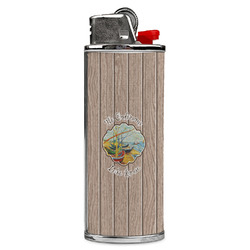
Lake House Case for BIC Lighters (Personalized)
4.5 Stars 21 Reviews
$18.95
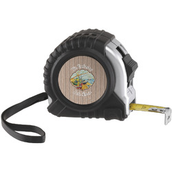
Lake House Tape Measure (Personalized)
5 Stars 34 Reviews
$17.95+
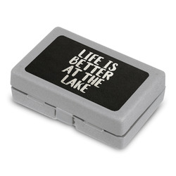
Lake House 26 Piece Deluxe Home Tool Kit (Personalized)
5 Stars 1 Reviews
$25.88
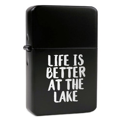
Lake House Windproof Lighter (Personalized)
4.5 Stars 2 Reviews
$28.95+
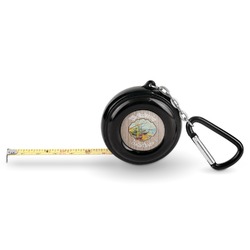
Lake House Pocket Tape Measure - 6 Ft w/ Carabiner Clip (Personalized)
5 Stars 2 Reviews
$11.88
